design system
One ink. One red.
Four rooms.
This page is the design system behind this site and its sibling apps — the code is the spec. Every token, component and motion pattern lives here, and works in all four rooms: try the room switches in the header. When a new component is needed anywhere, it gets designed on this page first.
restraint does the talking: chrome is monochrome, color lives only in photographs, data, and one hand-drawn red.
01 · rooms
Only the paper changes.
Every surface keeps the same bones and swaps only its light: paper for the personal site, night for the party screens and dark mode, porcelain for the dog, stone for the dashboards. A component that only uses room variables works in all four automatically — that's the test, and this whole page passes it.
rooms are assignments, not prisons: the party app lets guests flip paper ⇄ night and remembers the choice. the one exception is the party TV — a giant screen in a dark room stays night, because its darkness is stagecraft, not preference.
02 · voices
Three voices, never a fourth.
Headlines carry the argument.
KICKERS · CAPTIONS · DATA · STATUS — the quiet voice that annotates everything
English leads. The system's entire public hanzi inventory is seven characters — three names and four card seals: 焕 · 暖暖 · 随想 · 造 · 动 · 暖 · 聚. A fixed set, not a pattern: concept names stay English in public copy, and full bilingual text lives only in /notes prose. Body text stays quiet, medium-weight ink for emphasis, links as thin underlines.
scale is the accent color: a 72px headline against 11px mono does what a bright hue would — without the hue. fonts are self-hosted woff2, zero CDN.
03 · the red
One red, four doors.
Vermilion #c3272b — the red-pen ink teachers grade with — is the only color the interface is allowed. It appears through exactly four doors, always as a hand-drawn stroke, never as a geometric block. Everything else is ink, paper, gray.
The marks
One gesture only: the brush swash under the name. Signature, not logo.
Alive signals
Live pulses, form errors, destructive confirms, the newest data point, first place. Things that need attention right now.
Selection
Select any text on this page — the red belongs to whatever is being read.
go ahead, drag across this line.
Her collar
Yumi is the one member of the house the design system doesn't apply to.
two content exemptions, because color belongs to content: photographs keep theirs (hushed — see 05), and data keeps its semantics (gains in muted sage #4e8a6e, losses in vermilion — numbers only, never chrome).
04 · marks
Signature, not logo.
No invented pictorial logo, ever. The identity is typographic and photographic: the name with a red brush-stroke under it, a red dot, or simply a real photo — the avatar is the icon.
og corner, headline keywords
never a signature (door 2 owns it)

a face beats any icon
never let one grow back into a logo
retired, on purpose: a square seal stamp (too official) · a neat circle around the name (too formal) · a casual double-loop scribble (tried it, didn't love it) · any cartoon or geometric logo (someone else's pen) · a red dot as the header mark (to the whole internet a red dot says "notification" — and here it already says "live"). The graveyard stays public — rejected ideas are how the system learned what it is.
05 · photography
Color rests at a whisper.
Photos carry all of the site's warmth, so they follow one law: at rest they wear a hushed grade — 60% saturation with a faint warm cast — that pins every picture into the same album. Hover (or scroll past center, on touch) and the color blooms back to full. Two tokens, --photo-rest / --photo-alive, and no component may hand-write its own filter.
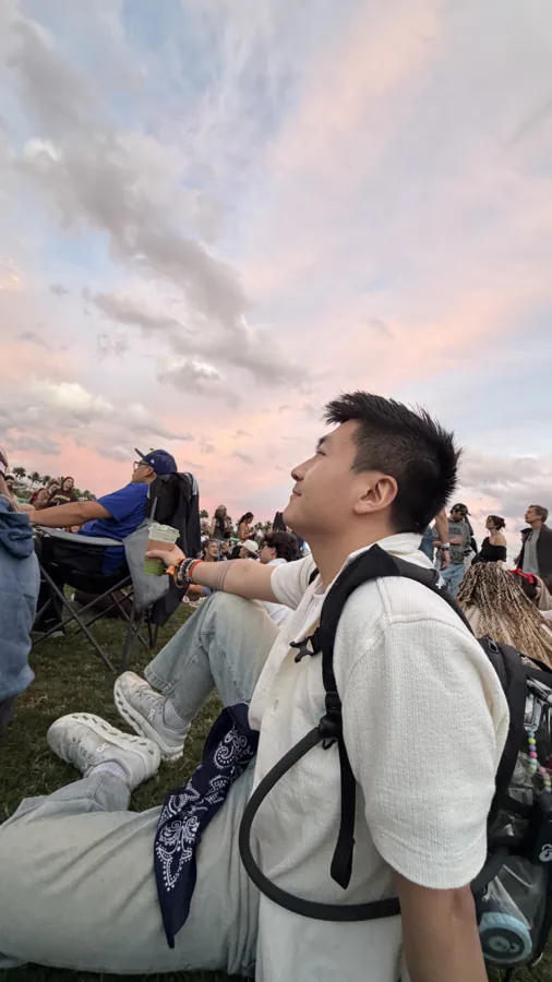
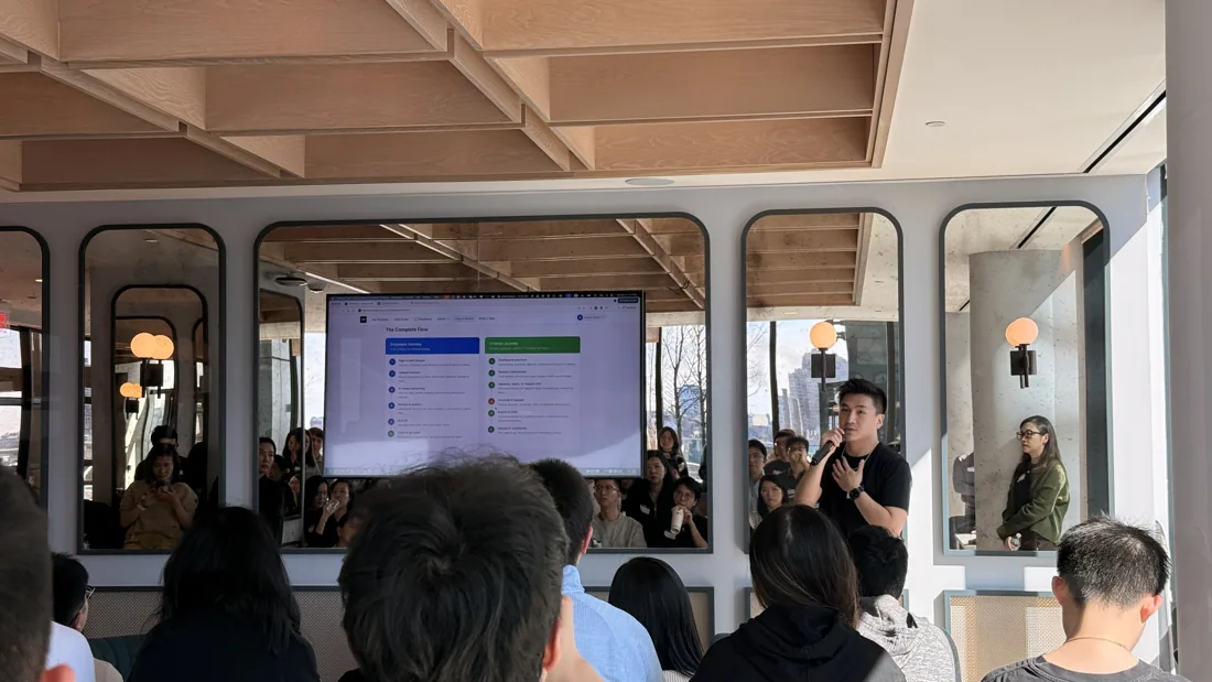
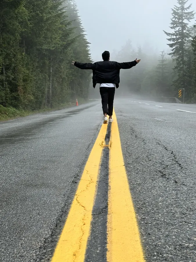
motion-first law: when a slot has both a still and a loop, the loop wins — poster and reduced-motion fallbacks always in place.
frames are rounded rectangles (20px outer / 12px inner) — the old organic blobs are retired. video loops: muted, playsinline, ~0.5MB, poster fallback, lazy off-screen. an earlier version rested photos at pure black & white; it fought the warm paper and read cold, so the whisper replaced it — chosen from a five-grade darkroom lineup.
06 · no emoji
Emoji are someone else's pen.
Interface chrome uses zero color emoji: they're cartoons drawn by a platform vendor, they carry their own hues, and they render differently on every device. Three substitutes, one per pen:
Type does it
Most emoji can simply be deleted — the mono voice was already enough.
🎉 THAT'S A WRAP → THAT'S A WRAP
⚠️ error → ⚠︎ error (text-form dingbat, U+FE0E)
✅ done ×3 → ✓ done ×3
The gray pen draws it
When a picture is genuinely needed — empty states, theme badges, reaction controls — a 2px line doodle in the current ink.
the doodle set grows as needed — shuttlecock, paw, megaphone, cake, crown, heart, fire, laugh, party, clap, wow, camera, speaker on/off, signpost so far. 2026-09-30: signpost added for the 404 page (§09 Reading). 2026-08-05: the last eight came from party's reaction tray + mute controls (Step 6d) — ported verbatim except clap, which shipped in party as an abstract impact burst and got a real redesign pass here first (two angled mitten shapes crossing at the wrist, impact lines above) so the canonical version actually reads as hands clapping.
The red pen celebrates
Ceremony comes from the system, not a party-popper glyph: first place gets a vermilion rank, warnings get the red hairline, big moments get big type and motion.
- 1team otter
- 2noodle
the one exemption: emoji typed by guests and users render as-is — that's their voice, not our chrome.
07 · the stage
Backgrounds can live — behind glass.
A stage is a layer of living media between the paper and the chrome — a video loop, a photo wall, a slow generative drift. Hosts own what plays on stage; the system owns the proscenium: every stage wears the whisper grade, a room-colored veil, and the grain — non-negotiable, so anyone's media automatically belongs.
that's a wrap
Thanks for coming!
1team otter · 420 pts
video stage — live in the party app: the host uploads the loop, the TV wears it. also the post-emoji ceremony: big type and one red rank, no party-popper glyph
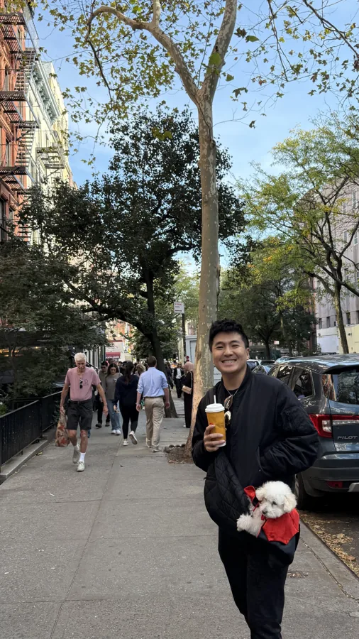
photo stage — two frames, 26s crossfade drift
breathing paper — the zero-asset fallback
- video already wired into the party app: the host uploads a loop in the control room (≤4MB, straight to media storage); the TV wears it on the lobby and farewell only — the moment a question opens, the stage clears. Guest phones never render it.
- photo Ken Burns crossfade; the party farewell can play the night's own guest photos — zero new assets, maximum personal
- scroll hero-only: film at the top, the page pulls the curtain as you read; never a whole-page video
- ownership hosts own the stage, the system owns the frame — the veil, the grade and the grain aren't host-configurable, so anyone's media lands on-brand
- tempo stages move at ≥26s — they're weather, not actors; micro-interactions stay ≤300ms
08 · motion
The page moves because you do.
Everything you touch answers within 300ms; everything that moves on its own is scroll-driven or slower than 26 seconds. A ~40-line JS engine feeds scroll progress to CSS custom properties, because pure CSS scroll timelines silently fail in half the browsers out there. No JS, or reduced motion? The page is already in its final, fully readable state. Zero dependencies, no WebGL.
one stage, five reflexes — bring a pointer and play. everything answers within 300ms.
Cards stand up
rotateX(22°) → 0 as they enter; older browsers get a one-shot rise instead of a scrub.
Ink fills as you scroll
Scroll up and down — the section title floods from gray to ink, left to right.
Stacking photo cards
The homepage opener: four real photos stack one over the last, each developing as it arrives. See it live →
card wording reveals together with its photo — text never sits static while the image performs. big scroll stories are always vertical and always carried by photography: a giant-logo zoom and an ink-bottle pour were both built, both rejected.
09 · components
The working parts.
Forms, data, feedback, navigation, party hardware, prose — every interactive part of every surface, in one place. All of it passes the room test; flip the header switches while you play.
Forms
focus = the border turns ink, no colored halos. tab through — every stop is visible.
Data
| holding | weight | day |
|---|---|---|
| NVDA | 31.2% | ▲ 2.4% |
| TSM | 18.7% | ▼ 1.1% |
ink line, faint grid — the newest point is red because it's alive (door 2).
Feedback
no photos yet — go enjoy the party, upload later
one toast at a time, ink on paper inverted. dialogs are native; destructive buttons wear the red hairline. empty states teach, they don't say "empty".
Navigation & party
corrected 2026-08-05 — this used to (incorrectly) say "texture, not color." Checked against the real party source: teams are solid hex colors, a fixed 8-color palette assigned in order (2–8 teams), rendered as a swatch. Team color is the third content exemption (alongside photos and data semantics) — a guest's team is their own identity, not a chrome color, but it stays on the swatch/badge only, never a card background or button.
Prose
Body text stays quiet at 15–16px with a tall line. Medium ink carries emphasis, inline code sits on a panel, and the divider refuses to be a full-width line:
···
Quotes get a 2px ink bar and a little more voice. 双语是两种声部,不是翻译。
Reading
the parts every long page shares. skip link — the first thing a keyboard lands on, hidden until then (shown here in its focused state). focus — one global 2px ink ring, no colored halos. progress — the 2px red hairline under the header on notes; red door 2, it's live. page changes — a .2s cross-fade with the header held still, off under reduced motion.
pager — older on the left, newer on the right, one column on phones. whole half is the link; the title underline thickens on hover. no red: moving between notes isn't a result.
no page at this address — the notes are at /notes; everything else starts at home
page-scale empty state — the 404. the signpost doodle, one sentence that says where to go instead. no joke, no dog: the home page already has enough of both.
10 · the voice
Write like a person.
plainone humane sentence beats three clever ones. empty states teach ("no photos yet — go enjoy the party") instead of announcing emptiness.
specificdecorative copy mines real details, never values-speak. "vibe coding past midnight" made the marquee; the six core values did not — true isn't the same as usable.
english leadsheadlines must stand alone in English; hanzi arrive as single-character seals (造 · 动 · 暖 · 聚) or names (暖暖) — footnotes, not the melody.
no thirdsthe same word or joke doesn't appear a third time on one page. one supervisor joke per page is plenty.
anchoredfloating captions must belong to their image — no joke gets parked on an unrelated photo just because it's funny.
dry humorthe mono voice keeps its spec-sheet deadpan: power draw: one espresso · latency: replies < 24h
11 · the rules
Eight rules derive everything.
rule 1chrome is monochrome; content keeps color (photos, data semantics)
rule 2red passes through four doors only, always as a hand-drawn stroke
rule 3three type voices, never a fourth
rule 4separation is a hairline; shadow means lift, never decoration
rule 5radius: 12–20px outside, 6–10px inside, pills fully round
rule 6everything touchable answers ≤300ms; every animation respects reduced-motion
rule 7components use room variables only — pass that, and all four rooms come free
rule 8new components are born on this page first. if it isn't here, it doesn't exist yet — design it here, prove it in four rooms, then ship it
12 · decisions
The system remembers its arguments.
A design system is a pile of decisions, and half of its value is the rejects. Kept public on purpose:
- 2026-06The warm orange era ends. Cream paper and #f47d31 had run the site since the start — proven, friendly, and increasingly everyone's default.
- 2026-07-03Five palette rounds. Crimson, magenta, marigold, brass, midnight, oxblood, electric azure — all built, all rejected. The lesson: the answer wasn't a hue, it was restraint.
- 2026-07-03Ink and the red pen, ratified. Monochrome ink, one hand-drawn red, four rooms. A square seal stamp and two circle marks were tried and retired the same day — the red pen won.
- 2026-07-03Two openers die. A giant-glyph zoom (logo as protagonist) and an ink-bottle pour (drawn props, diagram energy). The stacking photo cards ship instead — photography carries the big moments.
- 2026-07-03The whisper replaces black & white. Pure grayscale fought the warm paper; a five-grade darkroom lineup settled it at 60% saturation with a warm cast. Same day: the emoji ban.
- 2026-07-04The stage layer. Living backgrounds, host-owned content behind a system-owned proscenium. Marks learn to whisper — signature, not logo. Party rooms become switchable; the TV alone stays night.
- 2026-07-05This page goes live. The lab becomes public — the spec, the components, and the graveyard, all in view-source.
- 2026-07-05The hanzi diet, and motion first. The three-pens metaphor retires to the internal docs; the public hanzi inventory is fixed at seven characters — three names, four seals. And when a slot has both a still and a loop, the loop wins: video is a first-class element now.
- 2026-07-05The dot retires as a mark. One shape, one meaning: a red dot already says "live" here — and to everyone else it says "notification". The swash is the only signature now; even the favicon is a brush stroke.
- 2026-07-06Filter, never on the video. Three loops on this page (and three more on /nuannuan) sat frozen — WebKit doesn't repaint a `<video>` that carries a CSS filter directly, even while it's technically still playing. Fix: filter the wrapper, never the tag. Now a checklist line, so it doesn't happen a second time.
- 2026-07-06Then a second, quieter bug in the same spot. This section's own hero loop still wouldn't play — in Chrome only, Safari was fine. The tell: the stage demo below it (scroll-revealed) played, the hero (a fixed opacity-0-to-1 entrance) didn't. Chrome appears to decide autoplay eligibility the instant a video attaches — one that's still invisible mid-fade seems to get skipped for good. Fix: autoplay video never gets an opacity-fade entrance again, plus a couple of delayed retries as a backstop.
- 2026-08-05Red gets a fifth door. A round of external research (CrowdVolt/Love+Money/brandtoolk.it/The Raw Materials) plus an Opus checkpoint review before any of it shipped, then a second Opus review before ratifying anything. Found that the system was already making red fills in places nobody had flagged (the party countdown, first-place ranks) — the rule said stroke-never-block, what it meant was never-a-surface-treatment. §1 now has a fifth door: a full-strength fill for one singular, one-time result — never on hover, never repeated across peers. Ratified under it: the scoring/podium reveal. Rejected under it, rebuilt in ink instead: the block-flood card and the scroll-drama tiles — a hover state and a decorative pattern both fail "the one result" test. Also corrected: §6's party section wrongly claimed teams use texture, not color — checked the real source, teams are solid hex from a fixed 8-color palette; that's now documented as content, not chrome. Also dropped: the split-pill button (zero real call sites anywhere).
- 2026-08-05Amber retired from data semantics. The hub's tri-state metric card (good/warn/bad) had quietly grown a third color, `--amber`, undocumented anywhere. Resolved: `t-warn` is plain full-weight ink, not a third hue — the system's whole thesis is that absence of color already reads as neutral, so "fine, but look" doesn't need its own color to say so. Data semantics stay two-valued: sage or seal, never a third.
- 2026-09-30Borrowed from a neighbor. An audit of thedaviddias.com, for the small things: a skip link, one global focus ring, page-to-page cross-fades, a reading hairline and a pager on notes, a real 404, RSS, fallback fonts sized to match so nothing jumps on load. Left on his site on purpose: tab-title games, triple-click facts, sound effects, a Konami mode, a back-to-top button — charming there, noise here.
13 · ratified, mixed surfaces
Decided 2026-08-05, against a full Opus checkpoint review.
Redrawn against rules 1–8 and checked twice: once before any of it shipped, once more before ratifying. Everything below is now canon (rule 8 satisfied); each card's .cand-for tag says which surface(s) it's for. This section is a holding shelf by history, not by meaning — the cross-surface pieces (photo deck, per-word reveal, ink-blot, scroll drama, block-flood) belong conceptually in §08 motion / §09 components above, and party's two TV-only pieces belong with the rest of party hardware in §14 below; they haven't been physically moved yet, only decided. Move them on the next real edit pass rather than reading their location here as their permanent home.
Photo deck public · party TV
Already named in the system as "photo deck 展开" — listed, never built. Hover fans real photos open on a shared perspective, each shallower than the last.
(fine pointer only — same gate as pointer-tilt)
Per-word heading reveal public
Each word masked at the baseline, rising into place on a stagger — gives section breaks a family resemblance without competing with the hero, which already owns scramble + typing. Fixed 2026-08-05: the first build fired on a flat setTimeout, so on a real page every heading below the fold would already be "revealed" before you scrolled to it. Fixed again 2026-08-05: IntersectionObserver-gated wasn't enough either — it still only fired once on first view, so if that first crossing happened mid-scroll the reveal was already over by the time you actually looked. Now it replays every time the heading re-enters view, matching the "↻ replay" button below it. Never on the hero itself.
Section breaks arrive.
Loading curtain public · hub
A full-viewport overlay in the exact background color; a 1px hairline grows, then the whole thing fades. Function, not ornament — nothing today covers "the page is arriving." Shown at demo scale; replays automatically whenever this card scrolls into view.
fixed 2026-08-05: a curtain that only JS can remove is a worse failure than no curtain — DS rule 6 requires no-JS to be a complete, readable page. Two safety nets, both required when this ships for real: a <noscript> rule that force-hides it (shown above), and a hard timeout in JS (~3s) that dismisses it regardless of load state, so a slow/failed data fetch can't leave the curtain stuck.
Ink-blot button public
The honest replacement for the ripple already cut — hover-duration and positionally meaningful instead of a 300ms flash. Fill is --ink only, text flips to paper. Fixed 2026-08-05: the pointer-only version left keyboard users with zero feedback — :focus-visible now fills the blot from center. Try tabbing to the button below.
Ruled baseline hub
The rule half only — text-align-last:justify was rejected (it fights Space Grotesk's tuned tracking, and a second underline would compete with the swash). On a report page this reads as ledger paper.
Holdings, this week
Self-drawing section rule hub
Same baseline as .ruled above, but it draws in every time the section scrolls into view instead of sitting pre-drawn — a report page with several section heads gets a small sense of arrival per section, not just once on load. Built defensively (2026-08-05): unlike the marks' self-draw above (which starts hidden and needs a <noscript> rule to force it visible), this one starts already drawn in plain CSS — JS opts a heading into the hidden-then-reveal animation by adding .js-draw right before it starts observing. No JS, slow JS, or a failed observer all just leave the rule sitting there finished, satisfying rule 6 with no fallback CSS required. Fixed 2026-08-05: used to fire once and unobserve, so scrolling back to it later showed nothing happening — now it re-draws on every entry, same convention as the per-word reveal above; reduced-motion drops straight to the drawn end state.
Holdings, this week
Overflow poster type + justify-fill party TV only
The one surface bold is earned: a fixed frame, an unpredictable-length string. The band stays ink — never a colored band.
justify-fill earns its keep here — "ROUND " plus a number that's never more than two digits is a genuinely fixed, bounded frame; text-align-last:justify stretching it edge to edge is exactly the point.
Amended 2026-08-05 — the party-name headline (tv.html) does NOT use justify-fill, and that's a considered call, not an oversight. .party-name sits in a flex-centered scene with no natural fixed-width frame to justify against, and justify-fill has no built-in ceiling. Type a short name below ("YUMI", "HI") and watch the left box stretch its letter-spacing into something absurd — over-stretch on the common case, since most real party names are short, not a rare edge case. Shipped instead: clamp(28px, 6.4vw, 88px) for viewport-responsive base sizing, a JS fitPartyName() that shrinks in 2px steps to a 22px floor while scrollWidth > clientWidth, and overflow:hidden + text-overflow:ellipsis as the hard backstop below that floor. Same input drives both boxes:
justify-fill — always edge to edge, no ceiling
clamp + shrink-to-fit — sizes down, ellipsis is the floor
Command palette hub
Rerouted from the public site, where it would be theater — 24 report pages plus an index is where Cmd+K earns itself. Icons and a thumbnail grid dropped: no invented iconography.
Block-flood card public · party
Whole card floods on hover instead of tinting an edge. Rebuilt ink, not red (2026-08-05): the original floods with a DIFFERENT hue per card — the variety carries it. One hue doesn't preserve that idea, it just spends the whole color budget on the most frequent interaction on the page, and a hover flood is ambient feedback rather than a signal — the same "confirms a click" failure mode as the ripple already cut. Rebuilt as an ink flood: same scale, same drama, and it's really the existing ink-blot gesture scaled up to card size.
Scoring effects party TV
Ratified as-is under door 5 (§1) — bars race in with an overshoot bounce, rank numbers pop, and first place floods its whole row red. This is the door-5 case in its purest form: one screen, one winner, once. It's also scope creep on a rule that already existed — canon already gave first place a red rank number (door 2); this just extends "the rank number" to "the rank number's whole row," same meaning, bigger gesture. Fixed 2026-08-05: used to auto-play once, 600ms after page load — so on a real scroll it had already finished by the time you reached it. Now it plays every time the board scrolls into view, same as the "↻ replay" button.
Scroll drama public
A word scales/tilts and a grid of tiles rotates off ONE scroll position, simultaneously — not one card fading in politely. Scroll the page to feel it. Fixed 2026-08-05: the "on" tiles used to flood red, chosen by i % 5 === 0 — pure decoration with no meaning, which fails rule 1 (chrome is monochrome) before it's even a rule-2 question. Now ink at 70% on panel2 — reads just as strong, no longer competing with the word for attention.
BLOCKY
Verdict block — "what this week asks" hub
Replaces the one-line attention strip, which gave a count and then truncated the first finding to 72 characters — so a reader told "3 urgent" still had to hunt the whole page for which three, and the page's own answer was to restate them at the bottom under "Also flagged", where nothing is read. Every finding states itself in full, once, at the top; then the ≤3 things to do, each carrying the same issue-key as the Triage card it maps to, so the list and the board are one object seen twice. Hard constraint (DS §11): everything here is computed by the grader, never written by the prose pass — the block has to render identically on a week when that pass never fires. A one-word verdict was explicitly rejected for this reason.
Chapter — a fold that keeps its number hub
A page with nineteen sections at one visual rank has no hierarchy, only order. Chapters give it three layers. The rule that makes folding safe: a closed chapter must still show its own headline number and say what is inside — otherwise collapse reads as deletion (DS §11 rule 2). Native <details>, so no-JS and reduced-motion both terminate on a complete, readable page. Try them: the numbers stay put when closed.
Work 工作4shipped
Commitments 承诺2overdue
Evidence 佐证31items
Status meter — a zero is drawn empty hub
The one that mattered most. This meter used to floor its width at 2% with a min-width:3px fill tinted --seal, so a goal that was touched zero times rendered a small vermilion stub: a bar drawn where there was no quantity at all. Now the track renders and no fill element is emitted. The shortfall is visible as the distance it isn't filled, the number stays at full weight, and seal stays on the number where §1 already sanctions it (跌朱只贴数字). The consumer trackers this pattern came from withhold red because they need you back tomorrow; a private accountability page has the opposite contract, so the red stays on the number and only leaves the bar. 2nd week is a computed consecutive-zero streak, not prose.
Foldable 中文 companion hub
The house rule is a companion line under the English, never a language swap — English stays load-bearing (settled in daily-reports 117b794, and §11 does not reopen it). What §11 adds: when the Chinese ships as full parallel paragraphs rather than a line, it roughly doubles the tallest block on the page, so it must be foldable and folded by default. The preference persists, and must be re-applied after any re-render — a page whose history picker silently resets the reader's choice is worse than one that never offered it.
Reading's zero is the one that repeats: this is the second week in a row at zero, with four books started and none finished.
14 · party hardware
Party's stage, built the way it's actually shaped.
Rule 8, taken seriously: the party TV prototype had a real podium reveal, countdown, and QR-code lobby chip that never made it into this page — meaning by the letter of rule 8 they didn't exist yet. Built here for real, in a container-type:inline-size frame so the sizing is relative to the 16:9 stage, not to this page's width (the source prototype used raw vw, which is correct on an actual TV and wrong here — fixed with cqw).
leaderboard · all rounds
1st place is door 5 (§1) — a single, one-time, full-strength fill for the outcome that won. 2nd/3rd stay ink. Real structure from tv.html's staged 3rd→2nd→1st reveal, not an invented layout.
.countdown.urgent — text color + pulse in the actual product; the filled circle here is this page's convention for "a number that needs a shape," not a claim that the shipped countdown looks exactly like thisFarewell photo deck party TV only
The wrap screen's photo backdrop is the night's own photo-reactions, fanned open on a timer instead of on :hover — a TV has no pointer. Diverges from §13's Photo deck card on purpose (2026-08-05): the first build reused that card's rotateX tilt at full-bleed scale and lost — a 3D-tilted stack either collapsed to zero height (three position:absolute layers give their parent nothing to size itself by) or, once sized, sat in the same central real estate the podium above occupies and glitched through it. Shipped instead: full-bleed, not a floating card, and each layer receives inward like nested frames at the screen's own edges rather than tilting in 3D, so the reveal never competes with center-screen chrome. Still wears all three stage-layer pieces — whisper grade, veil, grain (DS §4.5). Real structure from tv.html's #farewell-deck-layer.
at rest this reads as one full-screen photo — the fan (auto, every 32s+ live; on demand here) is the only tell it's a deck, unlike §13's card above which is hover-only.